
INDIE
SMART METRO CARD
SI612 PERVASIVE IXD
PROJECT DOCUMENTATION SITE
DURATION /
SEP to DEC,
2017
TEAM /
HANNA JEON, YILIN XUE, JANET LI, STEPHANIE KUO
ABOUT THE PROJECT /
Design a pervasive device that helps travelers more seamlessly explore the city via public transportation.
MILESTONES /
1. CONCEPT PROPOSAL
SCOPING THE TARGET AUDIENCE & INITIAL BRAINSTORM RESULTS
2. FORMATIVE STUDY
UNDERSTAND THE USERS AND FURTHER DEVELOP THE CONCEPT
4. DEMO
PROTOTYPING, CODING, ITERATING, AND USING
3. EXPERIENCE PROTOTYPE
SPEED DATING TECHNIQUE TO EXPLORE CRITICAL DESIGN ISSUE
KEY FEATURES

1. Context-Aware Information Through Entire Transportation Journey
Indie is a MetroCard that knows travelers’ context, whether travelers are finding their way or figuring out which line to take, Indie will be aware of that and become their go-to guide.
Indie interprets the environment through beacons embedded into the station, and give indoor navigation by receiving updated information constantly through its surroundings.
WHAT IS INDIE?

INDIE is a smart MetroCard that allows travelers to use public transportation in any city seamlessly and independently.
We named it Indie in hope that by using it, every traveler will have confidence in public transportation and get an insider look just like they’ve lived in the city for a long time.
It is a product that we consider to be used in the future where beacons are embedded into our daily surroundings.
2. Easy Navigation to Your Intended Platform and Exit
While travelers are in a metro station, indie will be there to tell them which line or which to take and how to get to their intended destination by providing simple navigation information such as turn right in 5 meters, go straight, etc.


3. Vibration Reminder and Real-Time Updates for Travellers
After travelers got on a metro train, indie will show which station they are at and how many stations left until destination. As the train reaches the destination, Indie will have a vibration reminder to notify users that they’ve arrived, so that even if the traveler isn’t concentrating on keep track of where they are, indie is there to help

4. Set Destination by Location through complementary kiosk and phone app
Setting destination for indie is super simple, both the complementary kiosk and phone app allow travelers to search by location rather than station names, so that it is more intuitive

OUR JOURNEY
Motivation
With the shared interest of exploring cities around the world among group members, we found people are suffering from navigating in the city like local people. We decided to propose a new concept about navigation to help travelers reduce their time on getting lost, and get familiar with the city in a short time. The design would help travelers wisely spend their time in traveling, and they could better enjoy the traveling experiences.
Formative study and results
We’ve identified travelers as the target audience that we want to focus on early on into the project and did a couple of preliminary interviews to better understand our users.
In the first round of interviews, diary studies, and cultural probes, we scoped it to mainly travelers who are on the go, exploring the streets. However, that scope presents more limitation than exploration.
So midway through our milestone 3, we went back to our former study findings, reevaluated our interview notes, and compiled a new affinity wall, which lead us to identify the use of public transportation as a more feasible area to tap into. In this section, you might see how our research goals have slowly pivoted from our initial scope to our final concept.
Diary Study
From preliminary interviews, we’ve decided on four main aspect of traveling that we want to understand better about, which are: general challenges, trip planning, navigation, and logistics. Then we formed the actual questions that we want to answer and designed our diary study based on that.
Here’s the list of question that we aim to answer with our study:
-
What are the biggest challenges during the trip?
-
How do travelers plan for their trip?
-
What makes navigation information reliable?
-
What objects do they carry around during their trip?
Methods
We’ve designed our diary study for travelers who are currently on the trip to better understand:
Travelers’ challenge while they are on the trip, their immediate responses and frustrations, and things that interest them
We recruited 3 participants through friend’s network and have them record their trip and upload photos for two to four days while they were at the trip on any digital tools they feel comfortable with. We also provided an instruction doc with what we need in specific, including a picture of all their belongings that they carry with them the morning before they head out and meals they took.
Then after receiving the entries, we also did a group interpretation session and developed questions about some interesting points or confusions we had about the entries and conducted after study interviews to get more clarification.

Cultural Probe
After conducting the diary study, we realized that because the study was spanned in the course of a couple of days and conducted remotely, we have no control in what aspect our participants are actually focusing on while they are on the trip, which leads to many questions closely related to navigation unanswered.
So we designed our cultural probe study to be more focused in that area and under the context of just one day, and formed more specific research questions around navigation as following:
-
How attractions, restaurants, and other places that travelers attend in a course of one day was decided? What helped them in making the decision to visit those places?
-
How do travellers navigate from one place to another throughout a day?
-
What navigation information helped travellers while they were transporting?

Methods
We’ve designed our cultural probe study for travellers who have recently been on a trip to better understand:
Travellers’ choice of navigation throughout a day and their thought process and what they encountered while navigating a city they are not familiar with.
We recruited 2 participants through friend’s network who visited a big city that they’ve never been to during fall break, and prepared a cultural probe kit that involves a map, some stickies, and a booklet of stickers that we’ve designed with icons of common things that are travel related and are important for us to know about such as devices, maps, signs, attractions, transportation vehicles (train, metro, bus), etc.
During the study, we asked them to map out their entire journey of that day on the map starting from their accommodation place, and have them write down they’ve reached each destination. Along the way, we would ask probing questions about what they noticed, their interaction with their companion, and have them show us photos they took throughout the day, and create sticky notes based on that. If they were stuck or can’t remember, we would give them the booklet and ask them to go through it to see if anything was reminded.
Findings
Through these formative studies, we developed a better understanding towards our users and among all the findings that we’ve gathered, there are couple of key insights that helped us effectively pivot our project to be more focused on helping travelers better make use of public transportation, which later informed our design.
-
Public transportation is the preferable way for our target audience to explore the city.
-
Most travelers, especially single travellers are very price conscious, so public transportation and walking are the two main ways of navigation for them.
-
Travelers like to have a relaxing authentic travel experience where they can explore the city like locals, which is why they choose public transportation.
-
-
Public transportation is challenging to use in many ways for travellers which cost them lots of travel time wasted in wayfinding or communication
-
Travelers want to make the most of their time on the trip but using public transportation usually cost them time in wayfinding and communications.
-
Travellers greatly rely on google maps for using public transportation in a city that they’ve never been to, but not all cities’ have google map integration
-
Language barrier makes wayfinding within the station or getting to the right platform/direction, which is mostly depending on how well the signs are installed, challenging for travelers
-
Purchasing ticket and getting the right destination are hard for travellers and takes up lots of their time.
-
-
Travelers need a good amount of rest to fully enjoy their experience, but using public transportation leaves them restless.
-
Travelers are constantly checking their phone while they are using public transportation because they are not familiar with the system and need to refer it to know where and when to get off. This leaves them anxious, stressed, and cost them lots of battery power
-
Travelers hope that they can take the time to check nearby attractions or just leverage that time to enjoy the street view but instead they are focused on getting down at the right stop
-
-
Phone as a device serves too many purpose during a trip and users are worried about its safety especially while taking metros
-
Travelers rely heavily on their phone for various purposes, including wayfinding, searching for closeby attractions, photo taking, communication, and trip planning. So battery life is something that they pay lots of attention to.
-
Travelers are very cautious about the safety of themselves and their devices, they don’t want to show others that they are travelers afraid that it would attract thieves or assaults.
-
Travelers try to avoid holding device in hand especially while in metro because they are afraid it might get mugged.
-
Some travelers even abandoned public transportation because of safety issue.
-
Experience prototype and results
From the findings of our formative study and concept iteration, we’ve set our final design to be a smart MetroCard with the following design goals:
-
Intuitive and simple way to plan for using public transportation
-
Effective and seamless way finding in metro stations
-
Relaxing and carefree in transportation experience
Our key struggle in design this pervasive system is what is the appropriate balance between proactiveness vs intrusiveness. Which leads us to our speed dating matrix that captures the different level of proactiveness in three of our key user journeys.

Methods
We conducted our study in the hallway of North Quad, which has a complex architecture structure that’s similar to a metro station, and set a destination, a platform, on the first floor, then used multiple artifacts like signages and a kiosk to enact an actual metro station and have our users go through the entire experience from purchasing ticket to finding the right exit with different versions of our prototypes (see the wireframes) that present different level of proactiveness.


Functioning Prototype
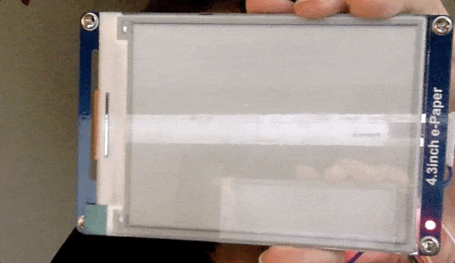
For the prototype, considering to the budget and feasibility, we only focus on the navigation function, and we did not use real Kiosk, or mobile app to set up the destination for the metro card. It is also an important part of creating great user experience. Also, instead of actual implementation with beacon detection, we used Particle mobile application to do wizard of oz and remotely control the changes of e-ink display to imitate the context aware aspect of our proposed solution.

Feature 1: Finding Platform
Feature 2: In Train and Vibration
Feature 3: Finding Exit


System architecture and implementation in progress
Final Packaged Prototype
Ideal System Proposal
Ideally the system should contain a Kiosk to help users complete their first purchase. They should also be able to set up the destination through the smartphone (figure1). The card will receive the updated information, start to communicate with beacon transmitter, and providing related navigation instructions (figure2). The information will be exchanged through bluetooth. The beacons will be placed at every corner in the metro stations, and on the door of the trains. When people are closing to the corner, the beacon will keep tracking users’ distance and update the information on the screen. When people on the train, the screen will display they are in the between of two stations. When the train is approaching the platform, the beacon on the train door will detect another beacon on the platform; and then the beacon on the train will send a signal to the card, and remind travelers to get off. After getting off the train, the card will keep guiding travelers to the nearest exit to the destination.


Figure 1: Complementary Kiosk Interface and Phone interface
Figure 2: Ideal System Architecture
Reflection
There were a few insights we learned from our project. First, it is not easy to decide what types of object is the most suitable to implement the design solution. In other words, there are many options we can think about as a smart object that can deliver our design solution. For this reason, it may hard to choose only one object among many other possible objects. For example, throughout the design process, one of the challenges we faced was to decide which object would be the best for our navigation design; it can be a bracelet, watch, or glasses. In order to choose the best object for our design, we thought about pros and cons for each object based on our research. Then, we ended up with a MetroCard because we thought it was the most suitable object for a context of the usage of a public transportation as a traveler. We also learned that a user’s experience can vary depending on the design of the “object”. During prototyping, we discussed different types of screen that we could utilize: e-ink paper, and LCD. The texture, color, and look and feel of the screen were different, and it would affect our user’s experience. We also even discussed the size of the screen. These object-related design elements also should be considered seriously for "pervasive design".
We think that the impact of our design will be greater if we can overcome the limitation; the system we designed so far only considers metro context, however, it would be better to extend our system to include other public transportations like a bus. City travelers also use other types of public transportation, and they have similar needs (e.g., current stop, and reminder) across all the types of public transportation. If indie could work well with any public transportation inclusively, it would provide a seamless public transportation experience to our city travelers.
For the next step, we can think about evaluating our design solution in the similar environment of a metro station we are imagining (The station has beacons everywhere). Although we built a working prototype that can show our design concept very well, it would be better if we can test our prototype in the environment which is as similar to our system architecture proposal suggested. Next, in order to realize our system, we would need to think about our system from a business perspective. Since the scope of our system design covers more than just a product (it covers entire metro station environment from a kiosk, platform to train), we need to consider its cost and impact to a city.
Findings
The user enactment helped us identify the following key findings which we used to further refine our concepts:
-
Providing provisional information of metro schedule sometimes bring our users anxiety, while immediate solutions and guidance within the platform is much more actionable and desirable.
-
Our users want more intrusive reminder train to notice it’s time to get off. A very visual focused reminder doesn’t fit with their natural behavior.
-
Users are anxious about getting off the metro at the right stop, and providing information of when to get off is still helpful. However, in their mental model, how many stops until the destination is more intuitive than how much time until destination.
-
Users are not used to seeing too much information on such a small transportation card, which makes some design with complex information presentation such as an indoor map or attraction map around exit confusing.
-
When showing which platform the user should head to, showing the last stop which signifies the direction of that metro-line is actually very confusing for users.